SCDAO.
Breaking Down the Incarceration Rate Through Digitizing Files

Overview.
Picking up on previously conducted research, my summer internship at Spark tasked me with leading the design decisions for the Suffolk County District Attorney's Office's (SCDAO) new project tackling the incarceration rate for misdemeanors in Massachusetts. Not everyone agrees with the digitization process, especially those who have worked for countless decades, but it's the right direction. Thus, the designs were made with the intention of convincing the most seasoned clerks and officers.
Team.
PM: Savannah Majarwitz
SWE: Jeffrey Jin, Raquel Joseph, Haidar Lafta
UX: Andy Vo, Joanna Jung
Role.
User Experience Researcher + Designer
Duration.
June — Aug 2021
Problem.
The Big Picture.
The United States currently holds the world's highest incarceration rate. For every 100,000 people, 639 are prisoners. To put that into perspective, over two million people are currently incarcerated in the United States, or 22% of the world's prisoners.
Rachael Rollins, the Massachusetts Suffolk County District Attorney, wants to significantly cut this statistic. She has specified various crimes that prosecutors should not prosecute for. Her goal is to lower the incarceration rate specifically for misdemeanor crimes, and alongside this, she is also working on implementing an anti-bail initiative as it is a poverty crime.
Backlash.
Unfortunately, not everyone agrees with this progressive decision and these crimes continue to be prosecuted. Currently, there are 150 Assistant District Attorneys (ADAs) spread across 9 courts making it extremely difficult to supervise. In order to figure out who is complying with the policy the client wants the ADAs to scan the following documents: criminal complaints, application for complaints, police reports, booking sheet, board of probation records.
The Goal.
The goal is to alleviate and automate some of the processes that take place in terms of transferred information from different entities involved in the legal process. The information presently comes in an inefficient paper form. The foundational goal of the app is to be able to fetch data from a few specific handwritten and typed out forms — data that is otherwise not properly collected by our internal operations.
Design.
Log In & Sign Up.
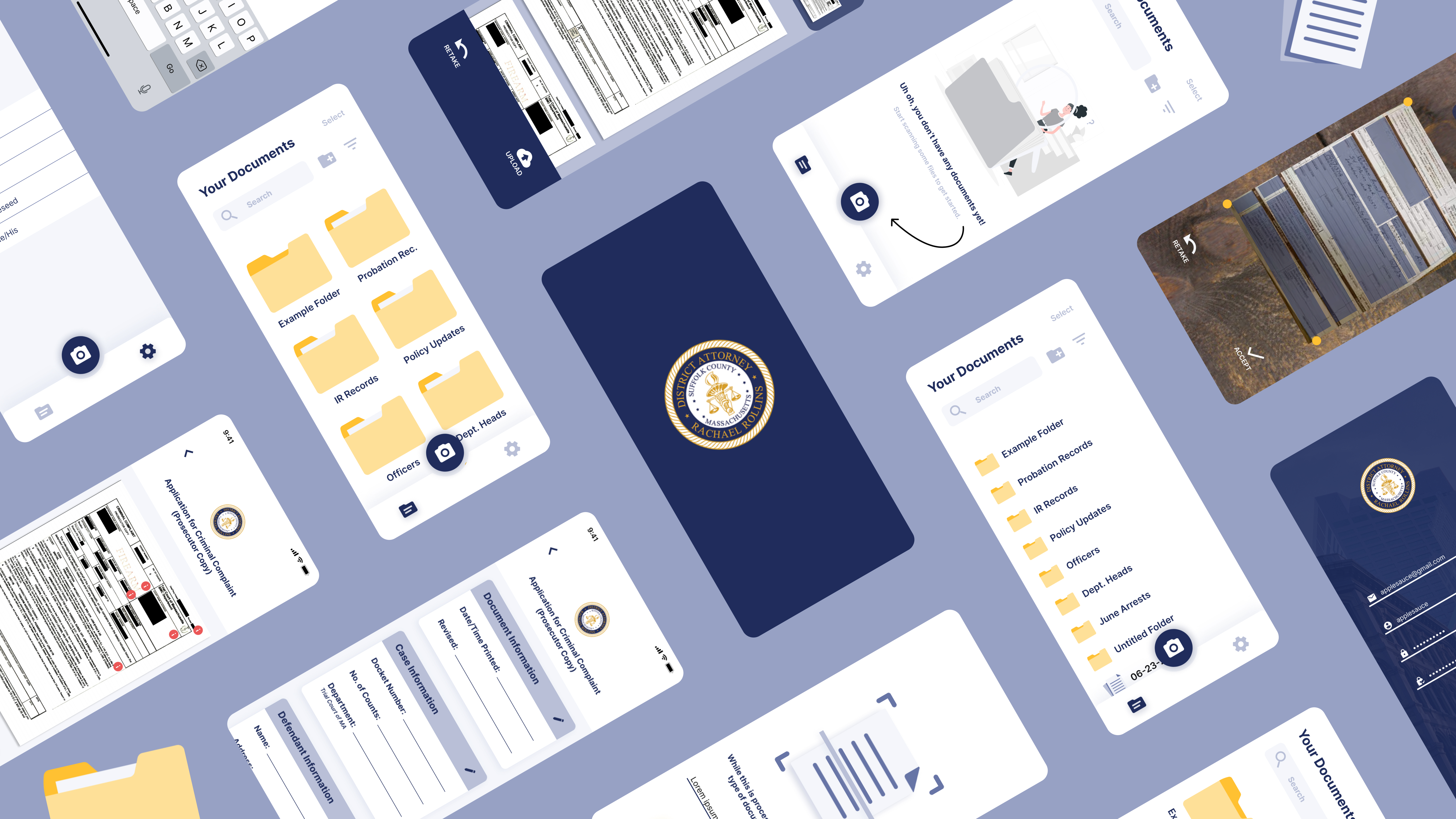
Logging in and signing up is usually a one-time process. To make those steps feel more personalized to the Suffolk County of Boston, I used the state colors on top of a background of Boston.
Navigating the Main Page.
A file and folder management system immediately screamed Google Drive, File Explorer, and Dropbox to me. To help transition older clerks and officers who weren't too well versed with technology, I wanted to design a product familiar to software they had used before. I made sure to design for the microinteractions including searching, sorting, and filtering.
File Scanning & OCR.
The app's main feature is the OCR & scanning feature, which is emphasized by the bold camera button. Of course, OCR is not perfect especially when recognizing handwriting so I designed a follow-up page that aids users with editing specific sections of a form without overwhelming them.
Reviewing Files.
After presenting an update to the client, one of the main concerns brought up was user accessibility for older clerks and officers who complained that the screen would be too small to read. I added functionality to opening documents by adjusting zoom levels and placed red icons to indicate where the user can touch to expand on.
All in All.
What I Learned.
The most important takeaway from this project was designing for accessibility. As a young designer, I'll admit that oftentimes, I follow a similar design structure and what that can lead to is the belief that I got it right the first time. This project really got me thinking beyond design and about how there will be folks who are simply averse to technology. It got me thinking that I'm not just creating a design or an experience, but that I am devising a cohesive argument for technology.
I think something that really hit me was that I have so much to learn. Going off of the point about sticking to my design routine, what I really valued at first about design was this creative freedom I discovered when I learned about new design elements and patterns. Throughout this internship, however, I felt like I wanted to showcase what I could do that I didn't let myself learn enough along the way. It was thanks to having a UX teammate on this project that really humbled me amd reminded me that I'm on the climb.