MuckRock.
Bridging the Gap Between Journalism and Data
Overview.
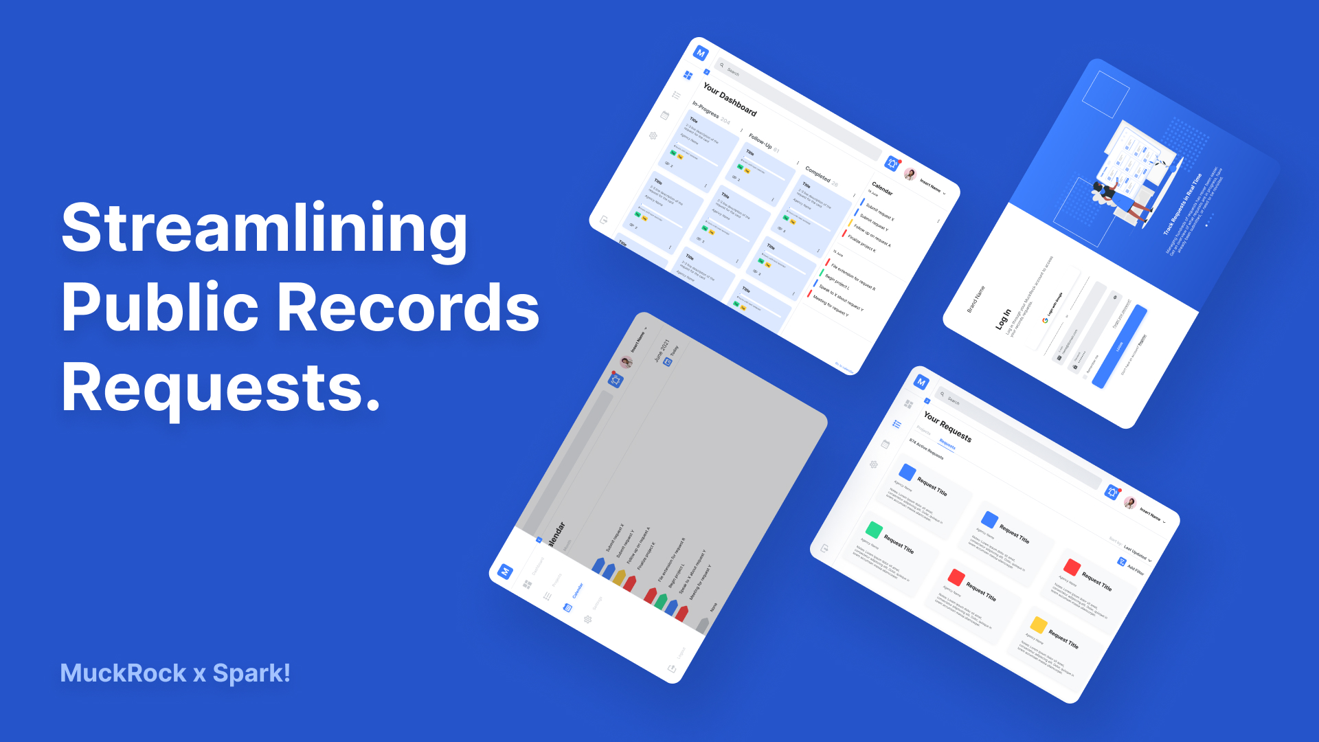
One of the projects I worked on at my internship at Spark was in collaboration with a non-profit that assists in digitizing government file requests — MuckRock. Through conversations, I found that journalists and activists shared one common struggle: tracking and managing the dozens to hundreds of public records requests filed. Our collaboration with MuckRock produced a sister service that synced up to a user's account, allowing users to be more in control of their management systems.
Team.
PM: Ian Saucy, Jane Feng, Sarai Thach
SWE: Shahaf Dan, Kehan Wang, Ayca Solmaz, Jeffrey Jin
UX: Andy Vo
Journalist: Lily Kepner
Role.
User Experience Researcher + Designer
Duration.
Nov 2020 — Aug 2021
Problem.
The Big Picture.
The public records request process, aka Freedom of Information Act request process (FOIA for short), is a lot more complicated than what I thought. After sending in a request, it takes up to an average of 80+ days across the U.S. to respond. Sure, most states specify a deadline for its government to respond but these are often missed. This issue and many more are challenges MuckRock is trying to address.
The Sister Service.
Prior to collaborating with MuckRock, the previous client and other stakeholders (social justice organizations, individual citizens, non-profits, etc.) brought up the concern of tracking requests and setting reminders on deadlines. The old system was digging through hundreds of chain emails in search of the right municipality and writing down reminders on sticky notes... Not so fun.
The task was to design a service that syncs to a user's MuckRock account to allow them to better manage and track their requests and projects on a centralized platform.
Research.
How to Improve the Request System.
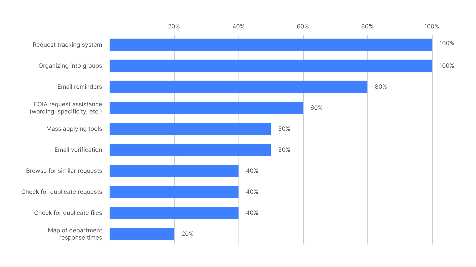
In the early stage of this project when the goal was to build a MuckRock equivalent prior to knowing of its existence, a lot of the research was to learn the ins and outs of the FOIA request process, the pain points, the bottlenecks, and the suggestions for improvement. After chatting with various government and non-profit agencies, I put together this bar graph to hone in one wants and needs.
Moving to MuckRock.
The team shifted clients to MuckRock after further research about the FOIA request process. In conversations with the MuckRock founder, Michael Morissy, we discussed our overlaps and established a list of desirables for the sister service based on previous interviews with stakeholders.

Information Architecture.
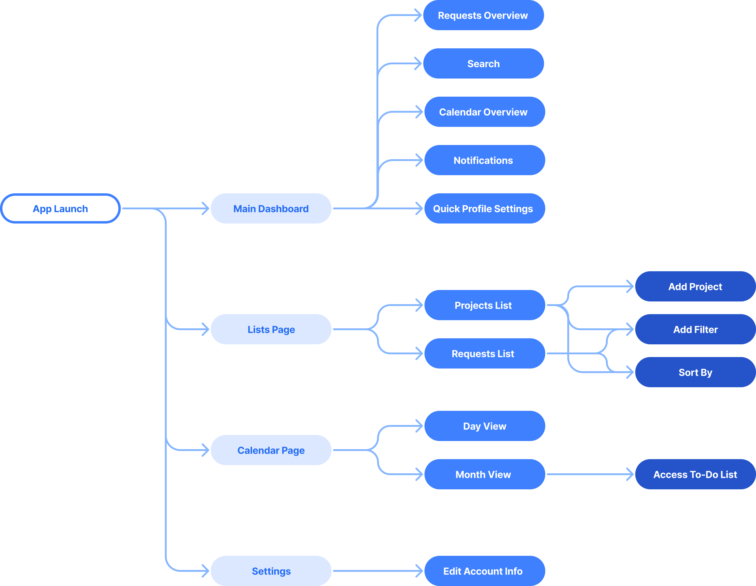
In the early stage of this project when the goal was to build a MuckRock equivalent prior to knowing of its existence, a lot of the research was to learn the ins and outs of the FOIA request process, the pain points, the bottlenecks, and the suggestions for improvement. After chatting with various government and non-profit agencies, I put together this bar graph to hone in one wants and needs.
Design.
Lo-Fi Wireframes.
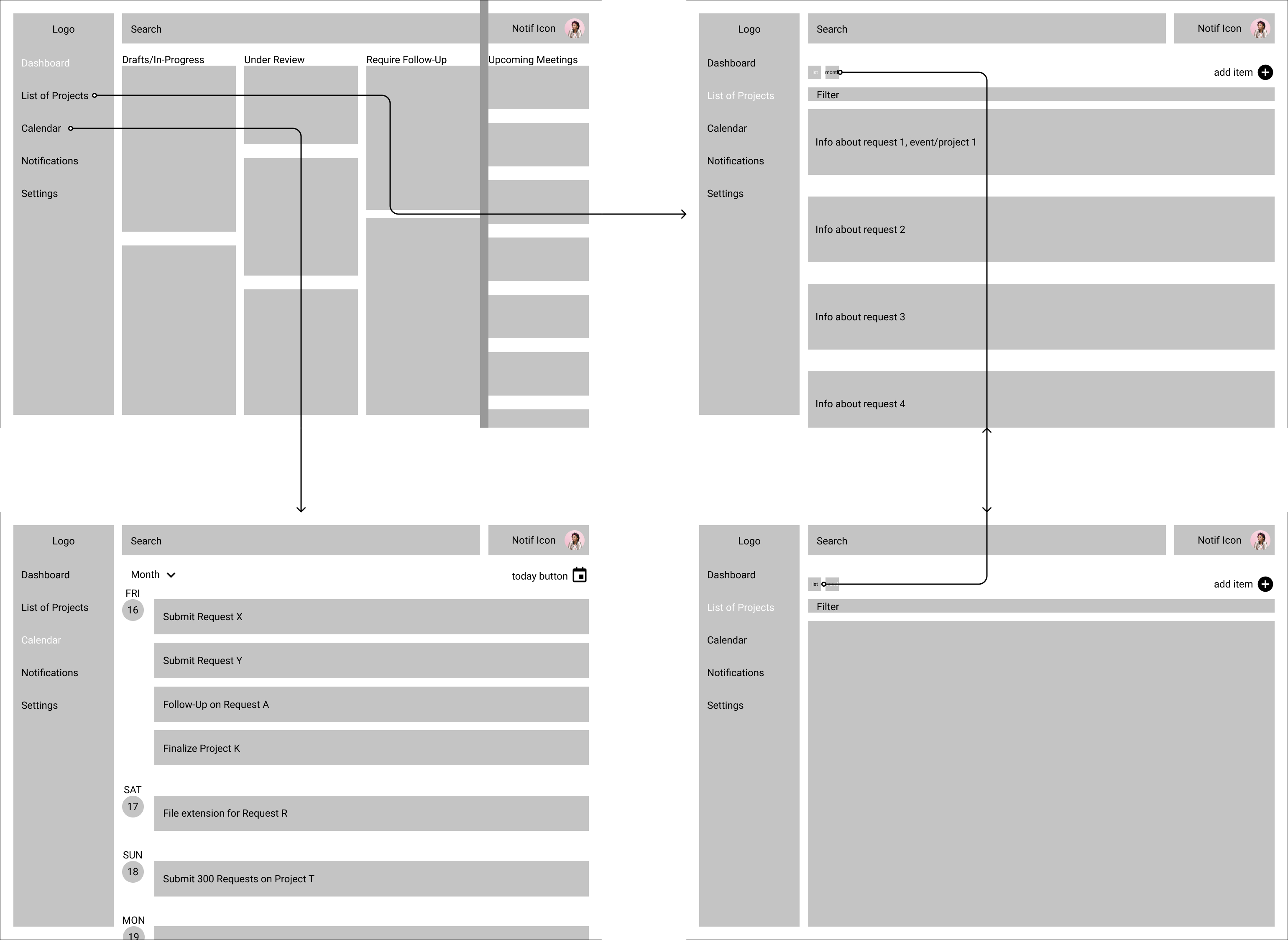
With the key features and user flow defined, I began to envision ideas by sketching low-fidelity frames on Figma that were inspired by Google Drive and Google Calendar. It enabled me ask more questions, pose more assumptions and unknowns, and explore my design thinking process to better present to the client.
The Product.
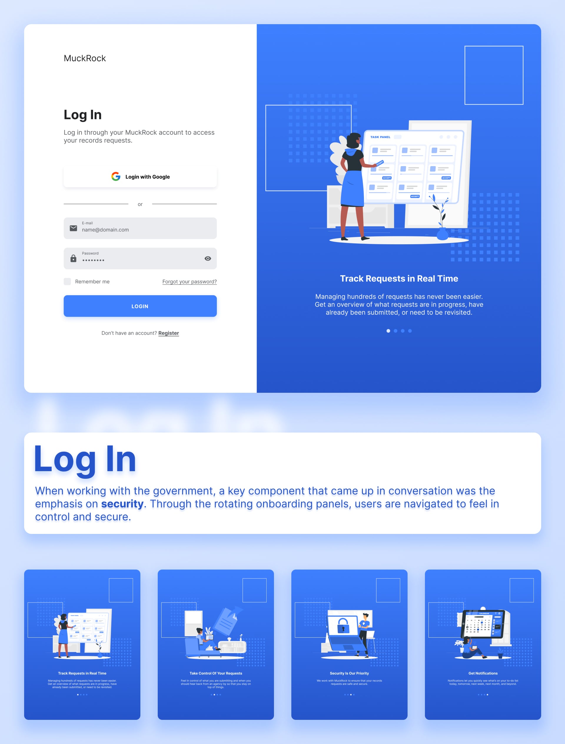
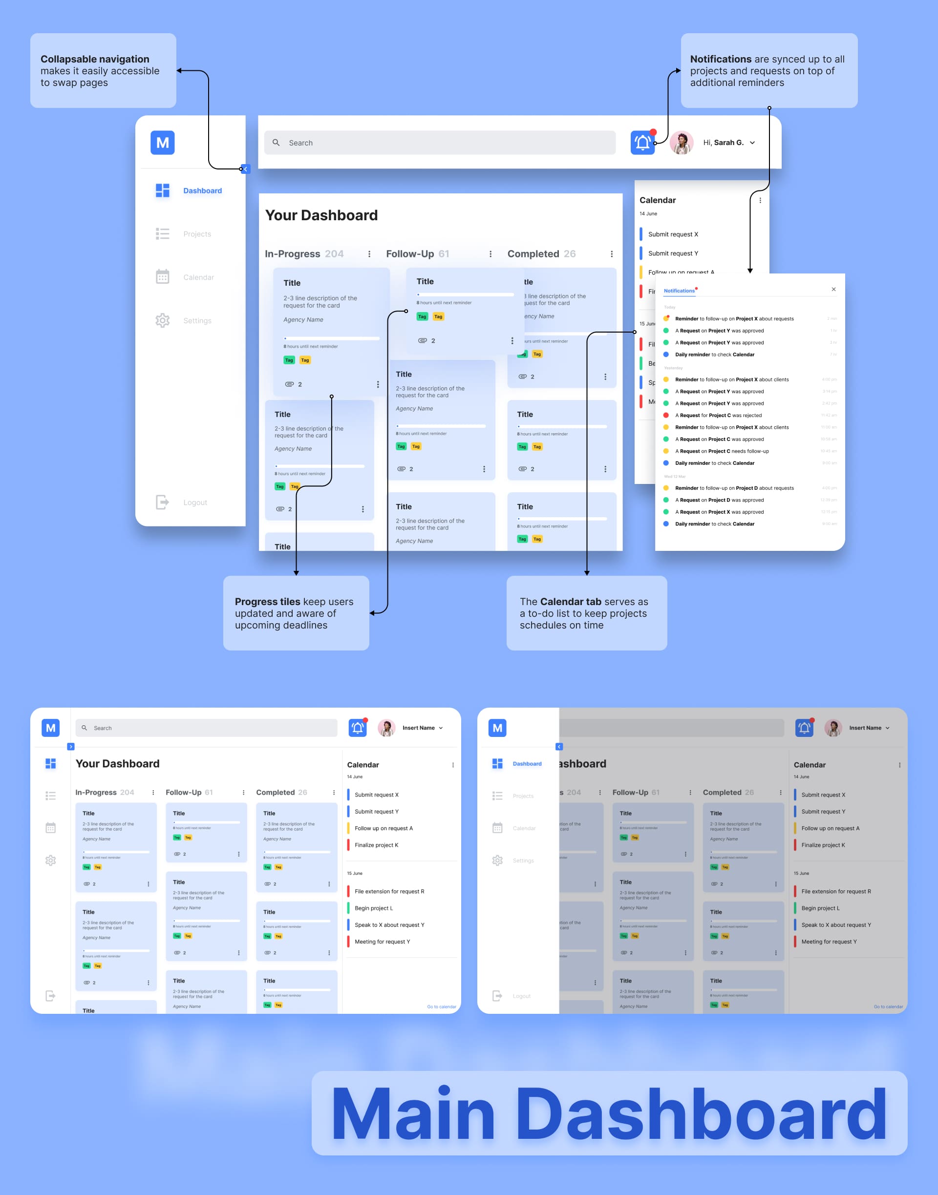
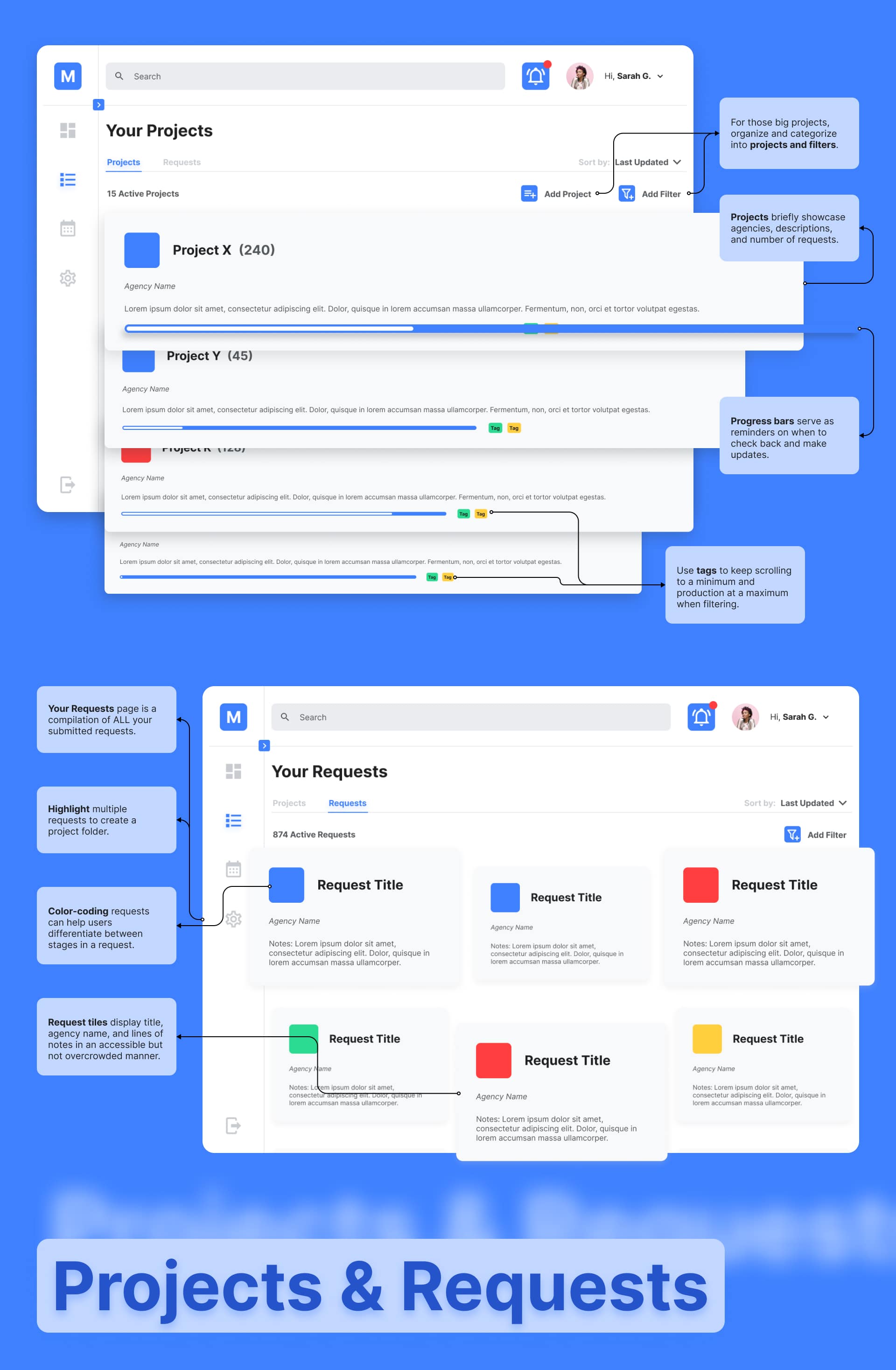
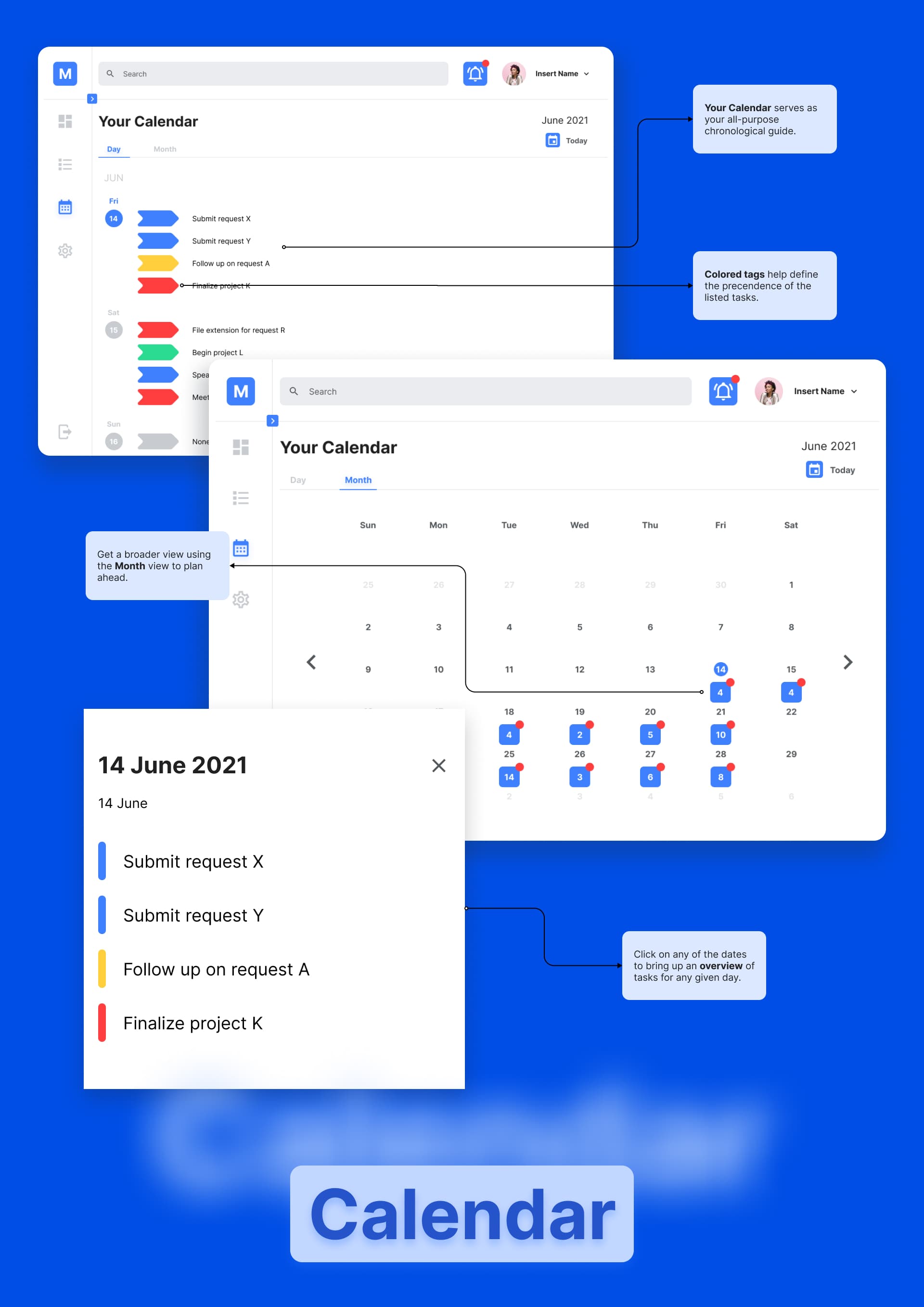
It's one thing to use management software, but to build it is something else. To visualize the usability of the interactions and the feasibility of the components since we're using React, I wireframed and prototyped my high-fidelity designs on Figma.
Summing Up.
What I Learned.
When I was first assigned to this project, it was so interesting to see how institutions would collect data via an old-fashioned letter mail system. I never really thought about the availability of public data, but it turns out the information isn't as public as the name implies. It really put into perspective the research that goes into activist and non-profit agencies.
This project also marked the first project where I had the opportunity to lead all stages of the design process in the product lifecycle. I savored every moment of my time with this project, from interviewing to designing, presentation after presentation. Not only was it a great project, but it was an incredible learning experience in being patient. Across the eight months, there were several moments where things got bumpy, including switching clients and communication between us and the client.