bumpcall.
Redesigning a New Way to Stay in Touch ~COVID times~
Overview.
Bumpcall is a start-up that aims to change the way we communicate by bumping into someone on the phone in five-minute video calls to tackle the looming anxiety of texts. While the entire creative team was involved in all aspects, I took the lead on designing microinteractions, and redesigning the userflow from opening the app to bumping into a friend.
Team.
Team of 3 (myself + co-founder + intern)
Role.
Digital Design Intern (UX + Visual Design)
Duration.
March 2021 — June 2021
Problem.
Texting is hard — you don't want to spam but seeing that iMessage bubble or read receipt is stressful.
Correlational analysis on the relationships between text messaging and social psychology shows a significant negative relationship between self-perception of text message dependancy and self-esteem. Similarly, the study shows a positively linked correlation between text messaging and social anxiety.
With the world on lockdown as a result of COVID-19, ongoing surveys show that screen time has doubled across all age groups, with social media channels such as Instagram and TikTok booming, correlating with mental distress.
Research.
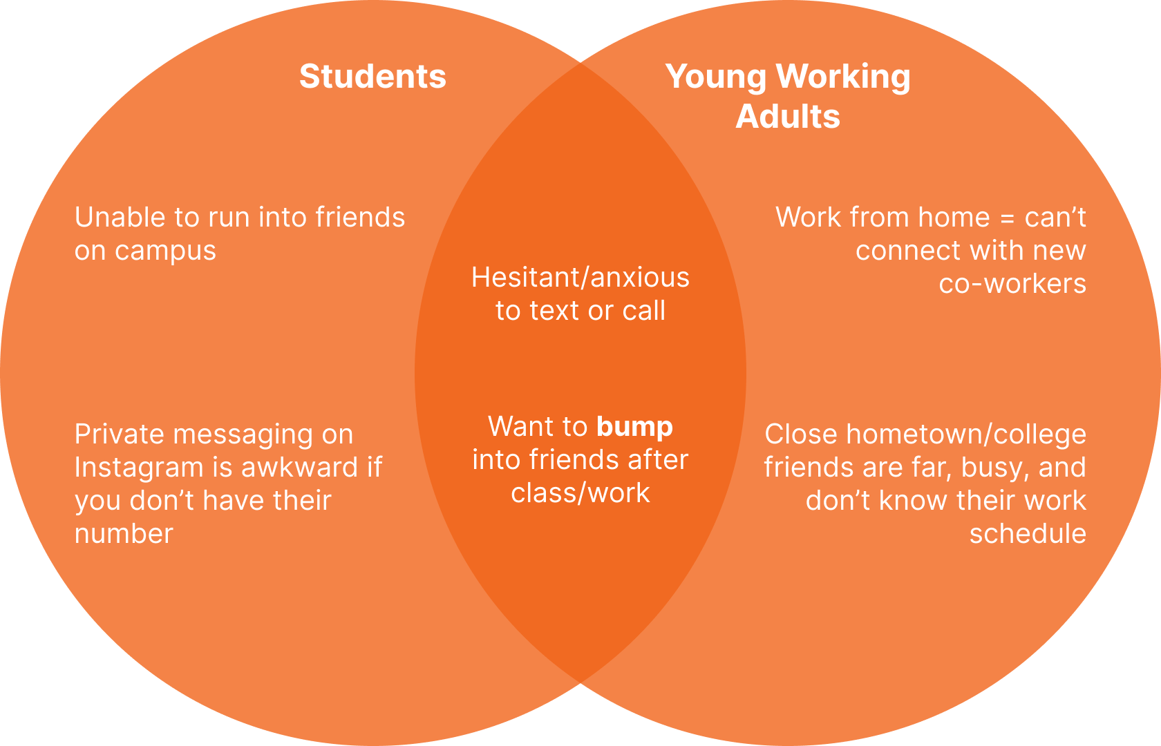
Target Audience.
The population I envisioned bumpcall impacting the most was the student and young adult population. While almost every age demographic and field of work interacts with people on a daily basis, the interactions students have with each other have more of a personal value.
User Flow.
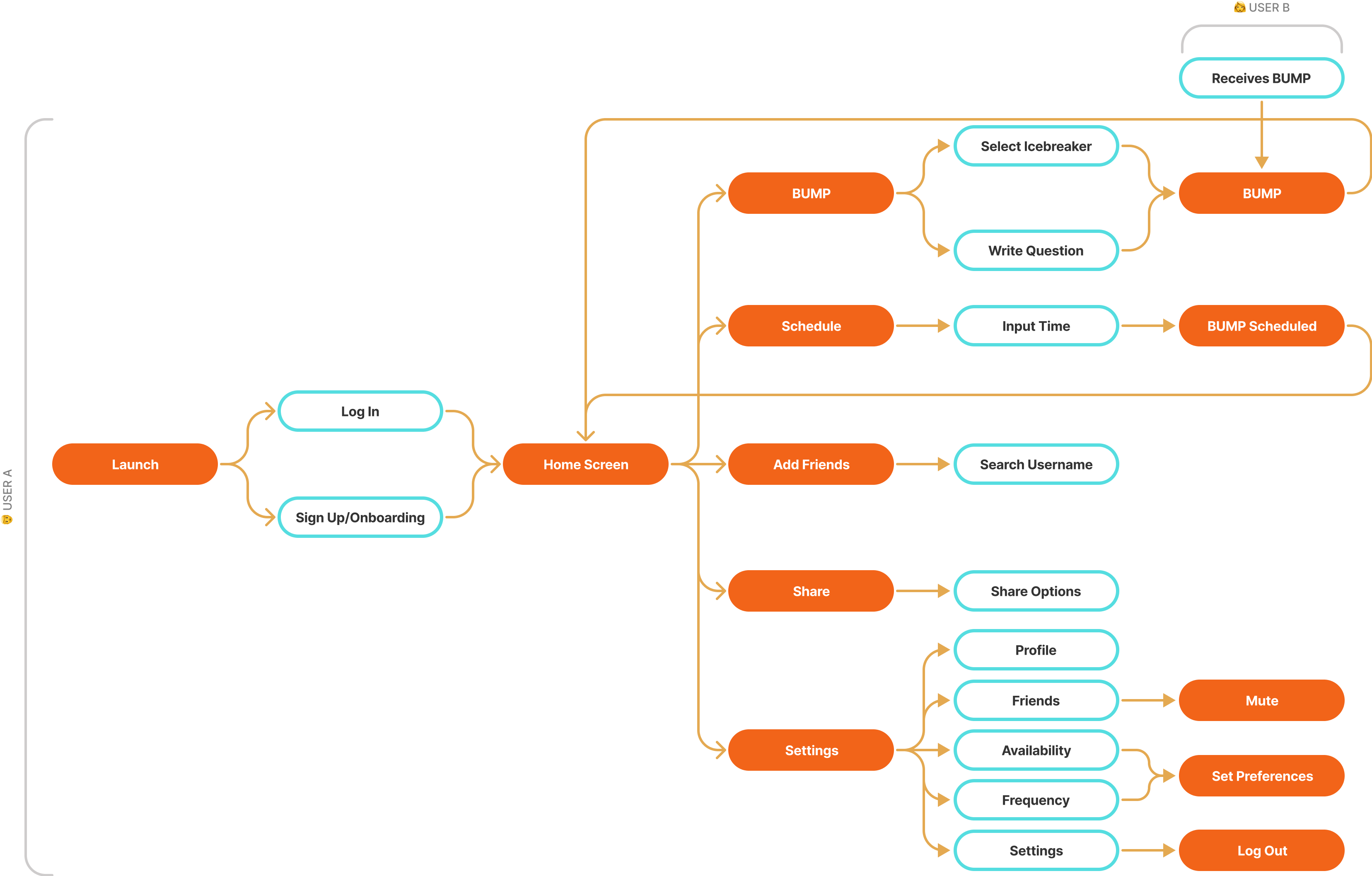
For this project, I believed that the steps between launching the app and getting on a call with someone should be as streamlined as possible. With added features such as icebreakers, setting and scheduling availability, and configuring the frequency of bumps per day, the diagram below organizes the order of the screens and the relations between them.
Design.
Previous Iterations.
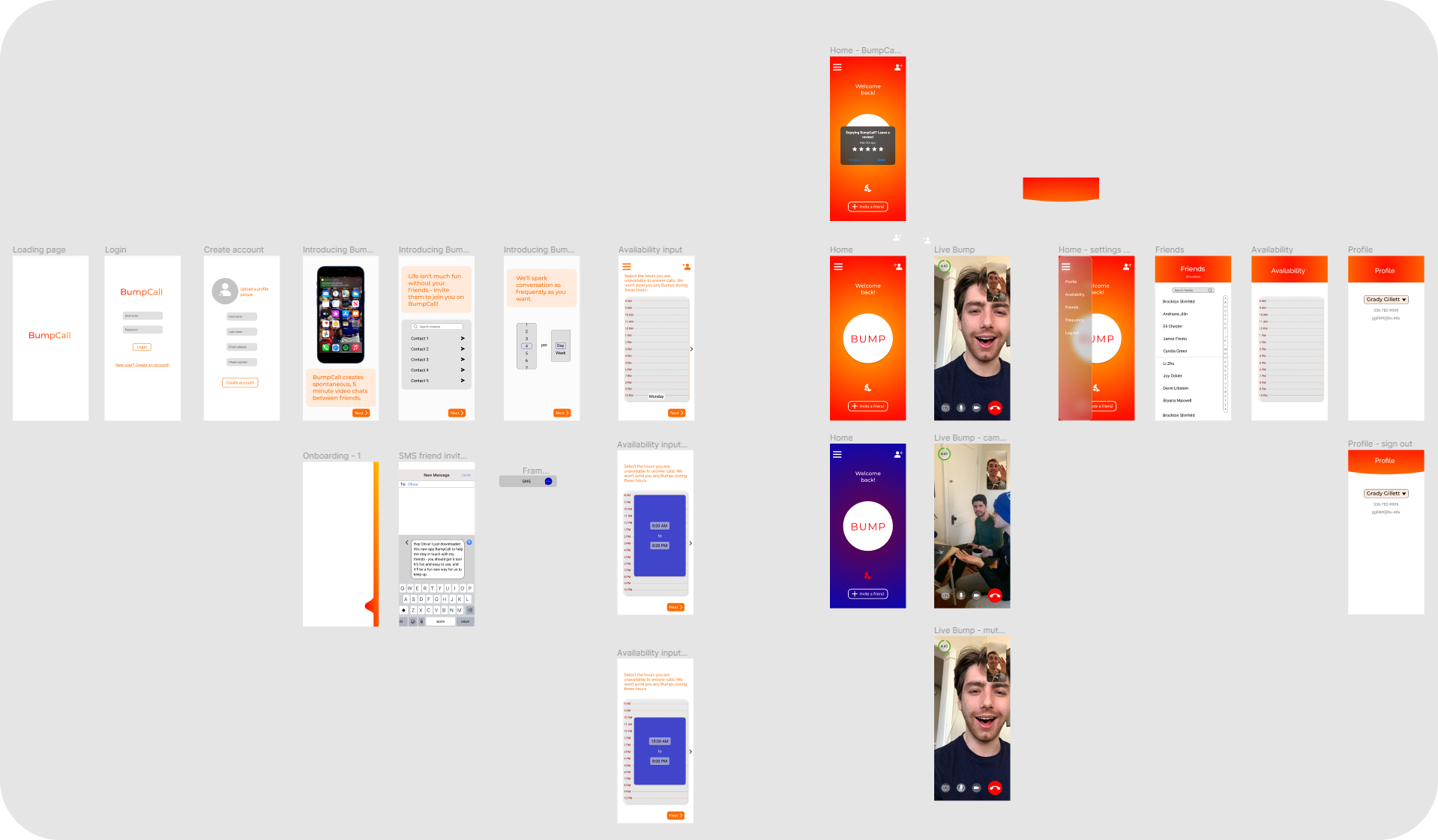
Before I joined, the Director of Product Design for the start-up made a few early-stage iterations. I went through the original prototype on Figma and constructed a list of all UX problems for the redesign process seen below.
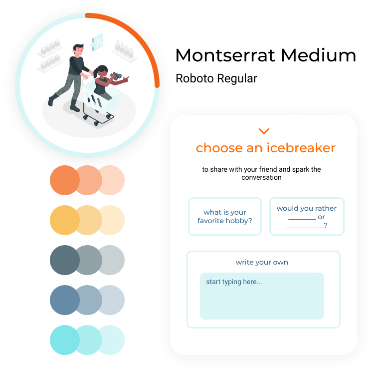
Typography & Color.
When I saw bumpcall for the first time, I was overwhelmed by the orange and white. I get that orange stimulates excitement and energy, so I convinced the co-founders that there was a need for other colors to balance the orange.
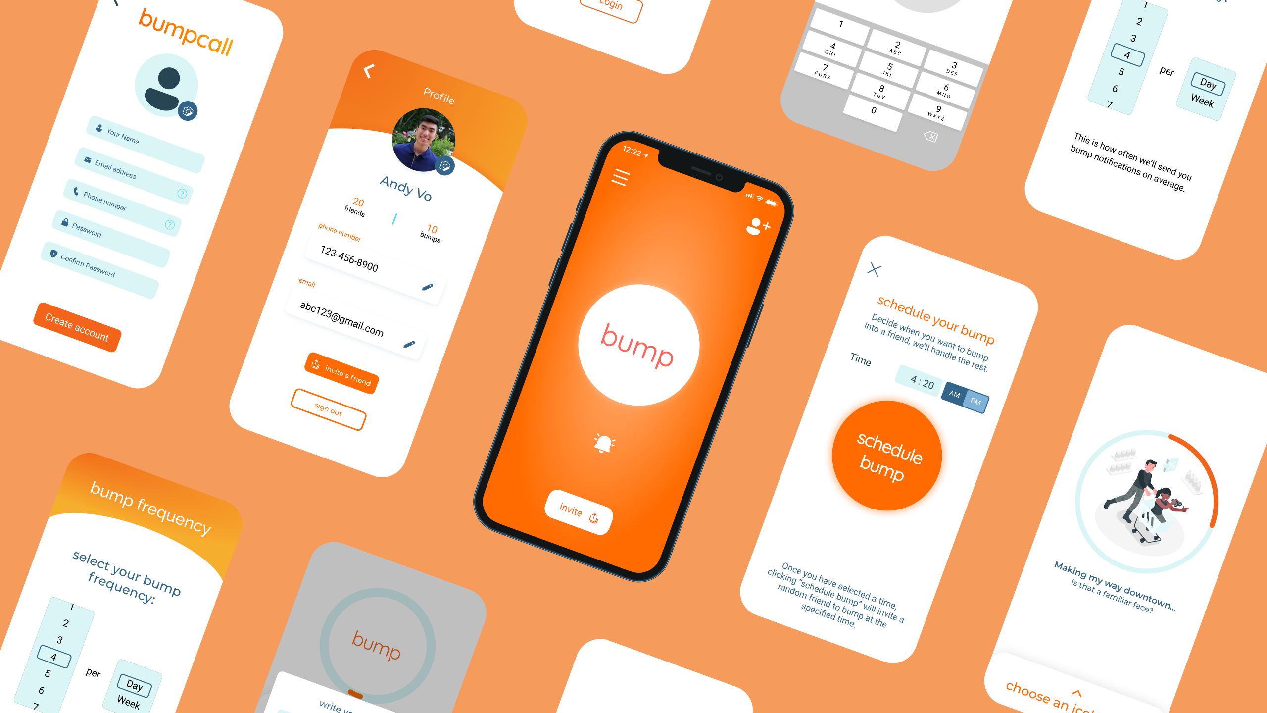
BUMP.
The way I saw it, the number of action items between app launch to the bump feature should be minimal. I saw bumpcall as an opportunity for those who are reconnecting, occasionally or routinely bumping into each other. My team and I designed the icebreaker feature to separate ourselves from FaceTime calls between close friends.
Inviting Friends.
Everything is better with friends, bumpcall included! To add to that celebratory feel of successfully bumping into someone, I wanted to celebrate inviting friends over to the platform. Since I joined the team at an early stage, I wanted new users such as myself to feel just as excited.
Personalized For the Extroverts And the Introverts.
After getting feedback from users, they noticed they bumped into the same people. I suggested a counter and timer feature on the back-end and designed a mute feature on the friends list. I love my friends, but there comes a time when I need my me-time.
Scheduling Bump Hours.
On top of frequency and availability features, I pulled inspiration from professors' office hours. I know my schedule, I know I usually bump into someone at 10:55 AM between lectures, and so to simulate that experience while sitting in my room in between classes, I translated that into a schedule feature on the app prototype.
Wrapping it Together.
What I Learned.
Start-up culture is something else. I was a Product/UX Designer, Graphic Designer, Marketer, and more. I made iterations of logos that fell short. I created graphics for the Instagram. I designed wireframe after wireframe. Was it worth it? Absolutely.
I came into this role looking for a place to start building my experience beyond designing at hackathons every other weekend. With no expectations, it was satisfying to see my work on a phone screen as an actual part of the product with user feedback. I've gone to my fair share of competitions but this was a full product with no 36-hour rush.
While it was frustrating at first to explain to one of the co-founders why all the components couldn't all use glassmorphism or why the orange needed other colors, it was a pleasure building on my experiences both as a designer and as a leader.
Impact.
The bumpcall userbase, albeit small, has expressed an increase in interest in the new features launched per update on TestFlight. I was not involved in user testing.