BUCSA.
Designing and Developing is a Two-Way Street
Overview.
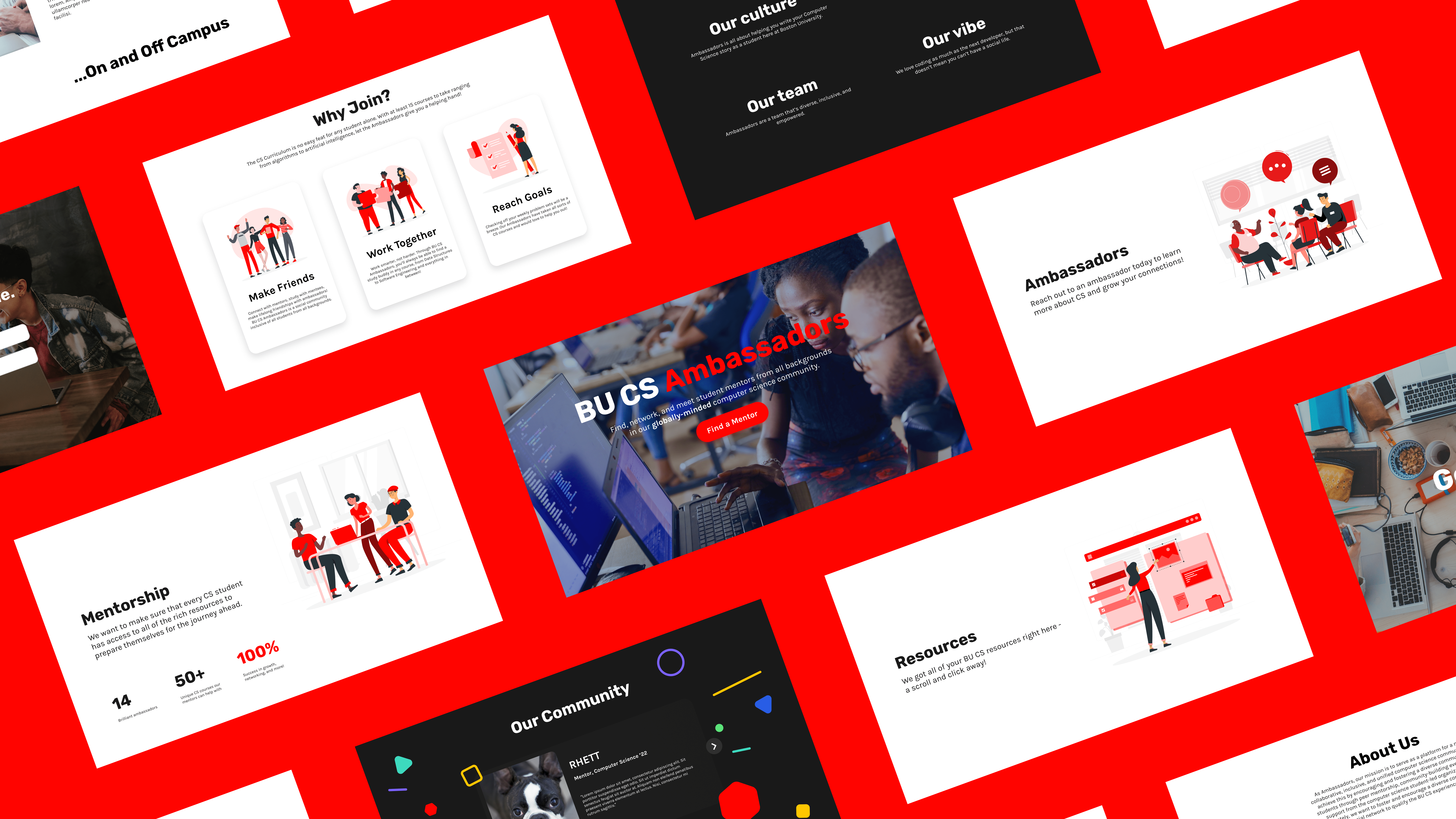
BU CS Ambassadors (BUCSA) hosted a two-week web design competition to redesign their entire website. As a student group that aimed to build connections through mentorship, our goal was not only to add color to a website, but to develop layers of depth in the meaning of their brand. Through our efforts, we successfully placed first.
Team.
Team of 3 (myself + 2 designers)
Role.
Web Designer + Developer
Duration.
May 2021 (2 weeks)
Problem.
The Big Picture.
BUCSA had a WordPress website that simply was not attracting incoming students. The initiative behind the competition was that BUCSA was in the process of getting their own official BU domain and saw this as an opportunity to rebuild the website from scratch for more control and flexibility.
Logistical Challenges.
Going into this challenge, my web development skills were relatively fresh. Less than a week before this challenge, I had wrapped up my first start-to-end web app from my software engineering course. I was on a bit of web design + development hot streak, but I had never been the sole developer of a full project before. With only two weeks, I gave myself a day to plan, four days to design, and the rest to develop. My two teammates didn't have programming experience so I wanted to make sure I had room to make fixes.
Research.
User Flow.
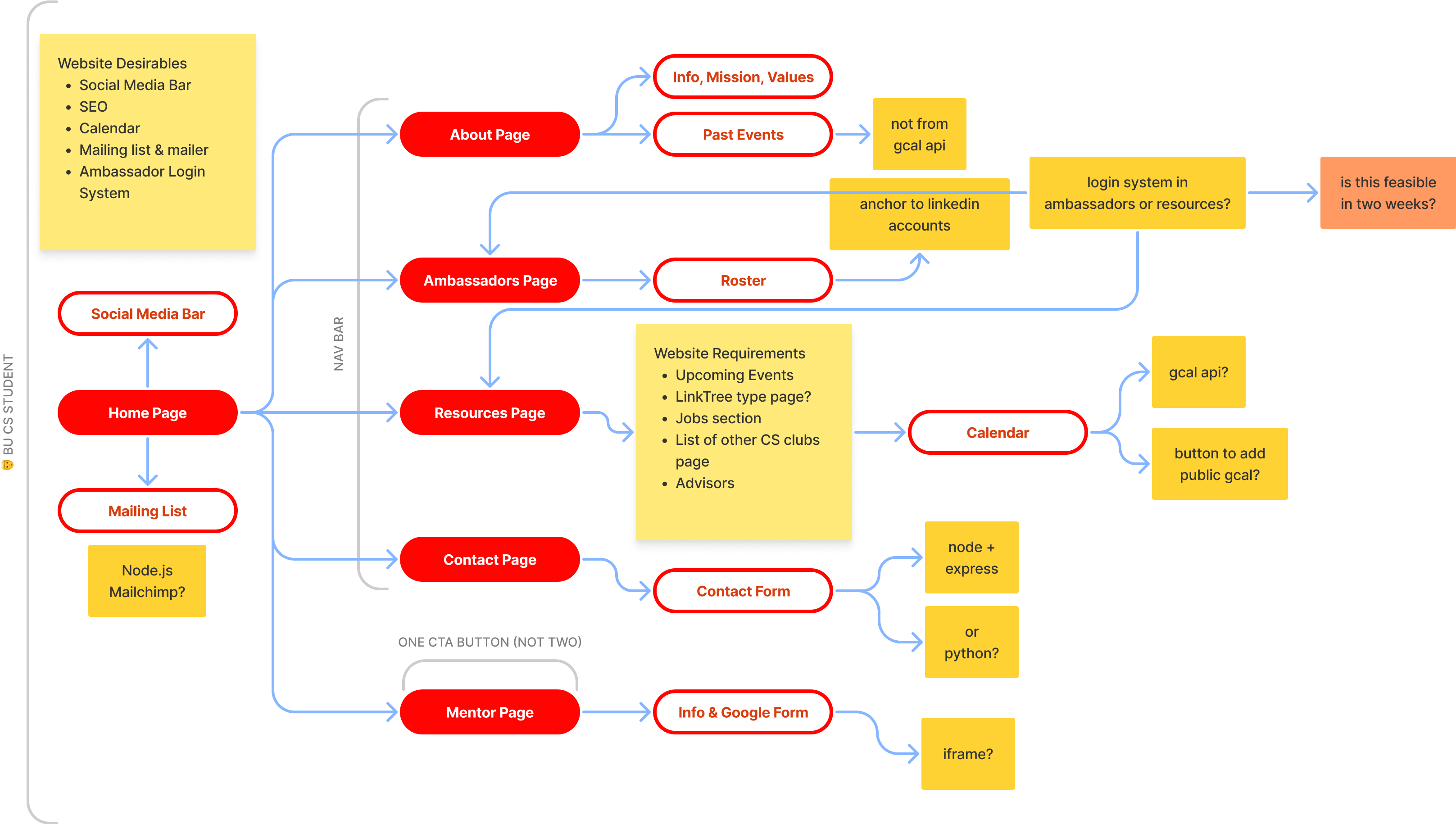
In their competition, the student organization had several website requirements and desirables. To maximize work efficiency, I listed out all of the possible decisions and technologies in a user flow to determine priorities.
Design.
Previous Iterations.
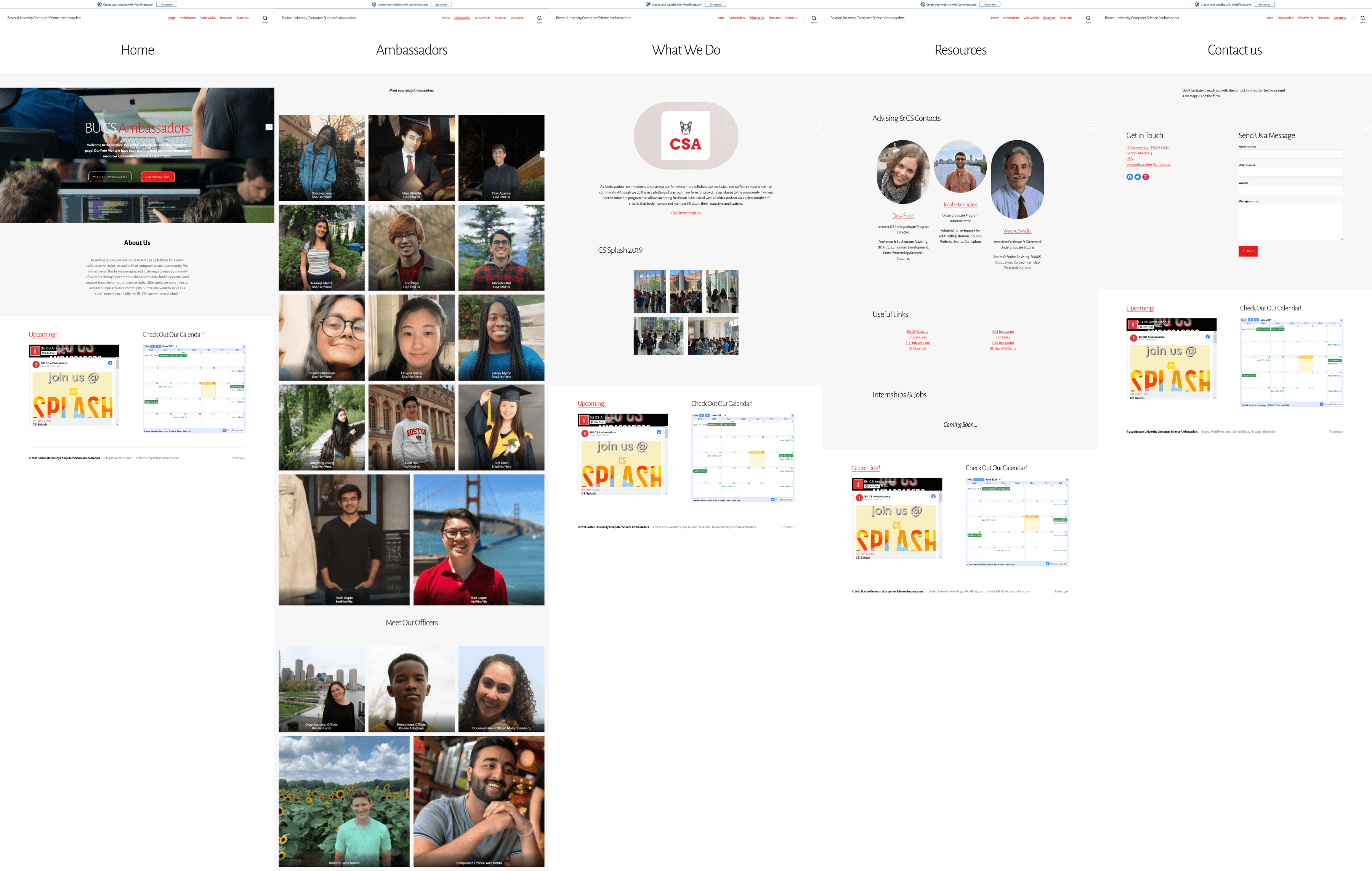
Fortunately, I had a lot to work with from the rather grayscale WordPress page provided. What their new website needed wasn't just a touch of color; they needed to focus on their brand.
Lo-Fi Wireframes.
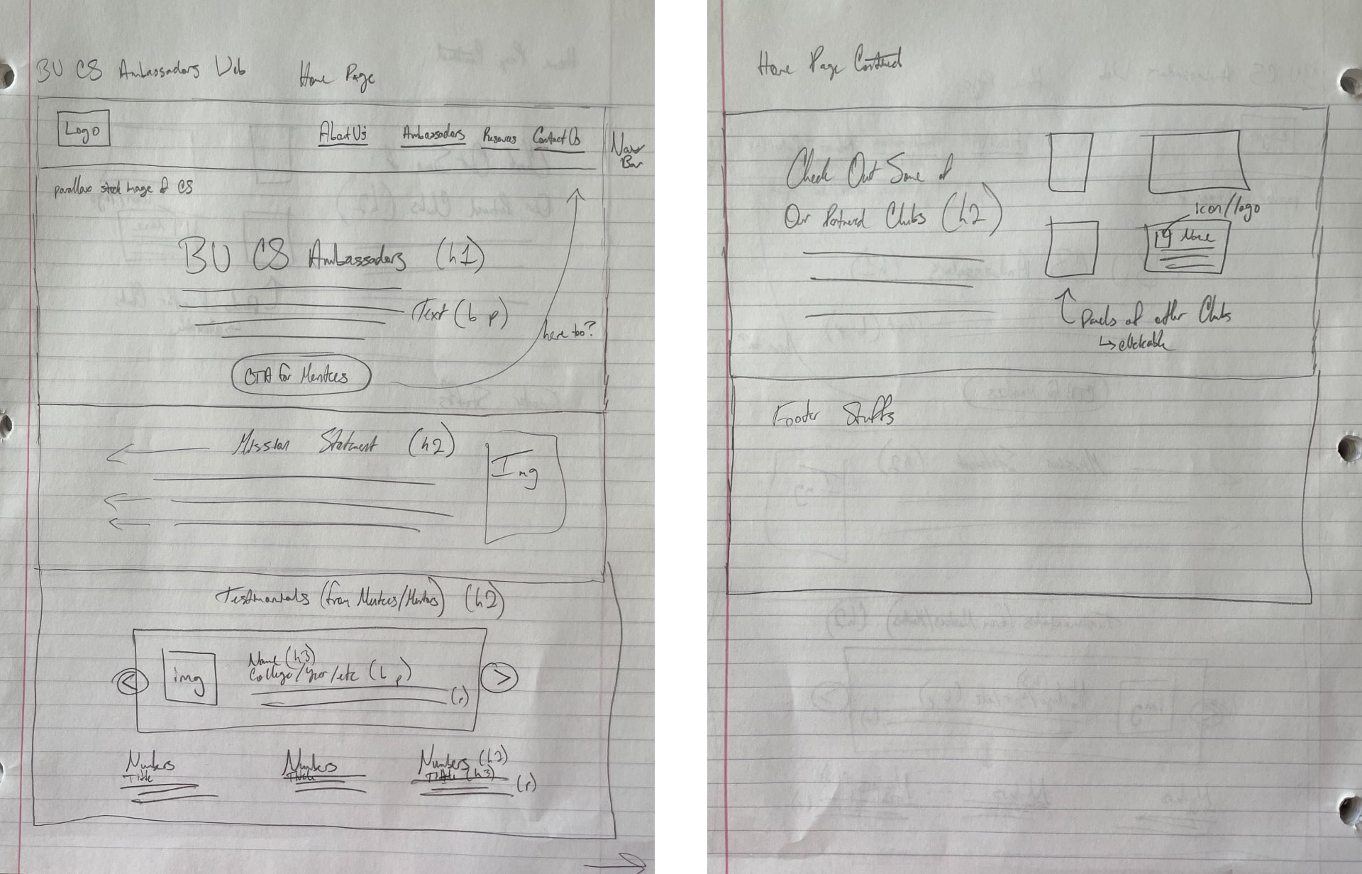
While the emphasis was on the redesign, I didn't want to spend too much time on drawing. The idea I envisioned was the Home Page as the centerplace where the other pages would branch out from. By designing this page, I had designed the visual hierarchy of other screens without losing time.
Color & Typography.
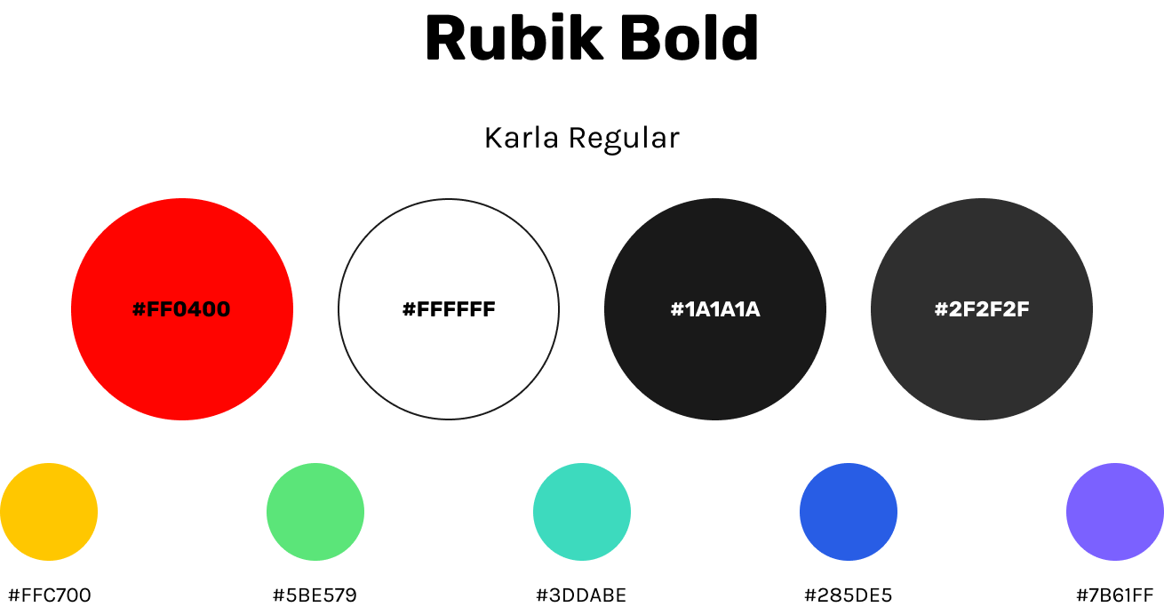
Here's where the fun begins for me. To appeal to the boldness and passion of Boston University's colors, I went for a bold red-black-white combination. Of course, this was aimed at college students, and to me, nothing screams college students more than going back to the basics of confetti colors. Additionally, I find the Rubik and Karla typefaces compliment the young energy of the colors.
BUCSA Home Page.
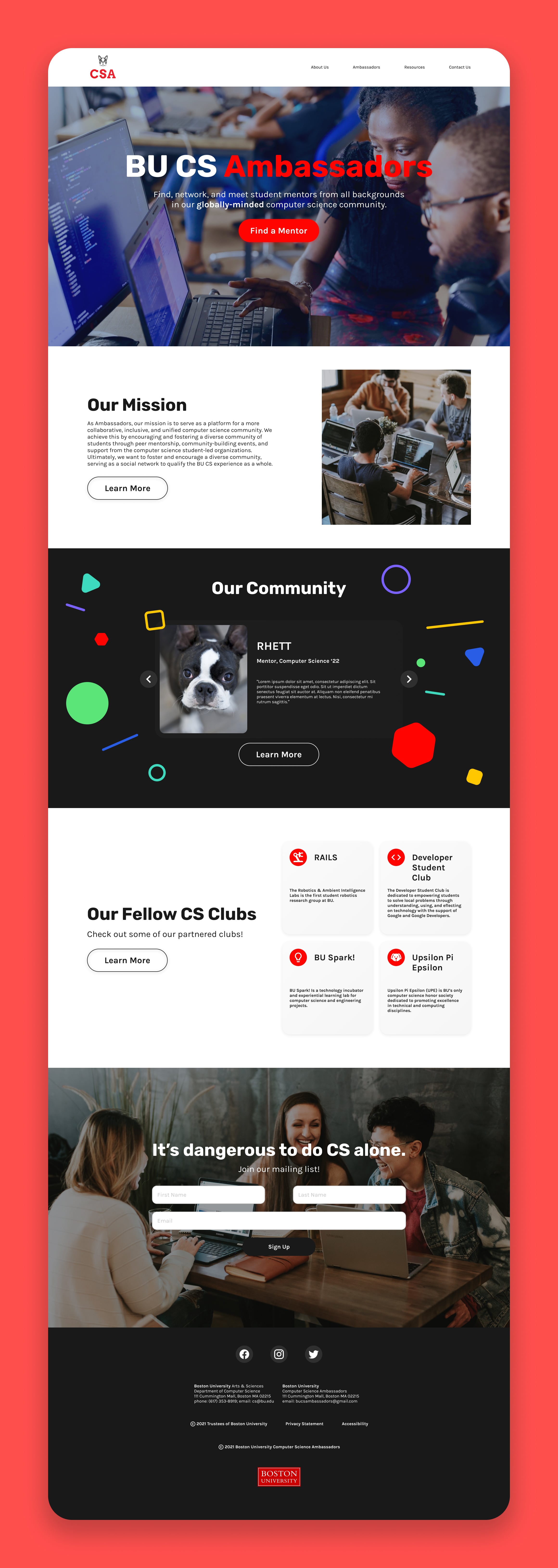
In a few seconds, the Home Page can be the final determining factor for students. Through visual storytelling and call-to-action buttons, I highlighted two of the club's main ideals — diversity and community — to attract new, prospective members.
Conversion-Focused Designs.
I improved the conversion rate of the website using visual elements, concise and informative structure, and more. These designs are live on the GitHub repo.

In The End.
What I Learned.
Designing and developing is a two-way street. As the lead designer and lone developer on this web redesign project, I learned what was feasible and what wasn't in a two-week project. It was an incredible opportunity to experience first-hand the compromises between creative ideation and feasible design. I have to say, as a front-end type of guy, implementing a Node/Express.js back-end was pretty fun.
First Place.
Winner winner chicken dinner. Lots of late nights and debugging hours paid off. After completing this project, I started valuing my own skills as a web designer + developer and my teammates talked to me about starting my own freelancing business. While I feel like I have a lot to learn, it's pretty neat having the eye for design and the patience for programming.
Future.
The next step is to collaborate with the Ambassadors to get the website up and running on their end.